Travelchem - a modern travel blog with a look like an app interface
Posted on
Task
Client - a couple of young travelers who are guided in the modern technological trends.
Requests: laconic design with a bias towards the application interface. Lack of clutter and ease of content orientation. The need to solve two problems simultaneously: show minimalism, but it fit the maximum amount of content.
The home page must present the “wow element” with animation to capture attention.
Possibility to control content pointwise, form, and display content packages from different headings.
Availability of subscription functionality, subscription analysis, the ability to send push notifications, and analyze statistics on notifications.
Highly optimized download speed and SEO-friendly set of functionality. A blog involves a lot of photo content.
Design development and content management
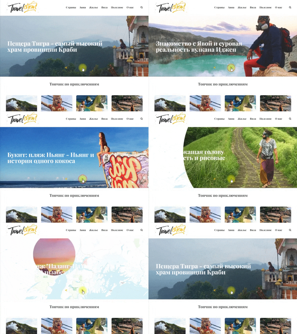
- The promo section (hero section), from the first seconds of being on the site, shows that this is a travel blog. It was decided to use a slider with animation of the globe and a map showing the effect of moving to different points of the planet. Top articles are displayed in the slides, which are pointwise determined from the admin panel.
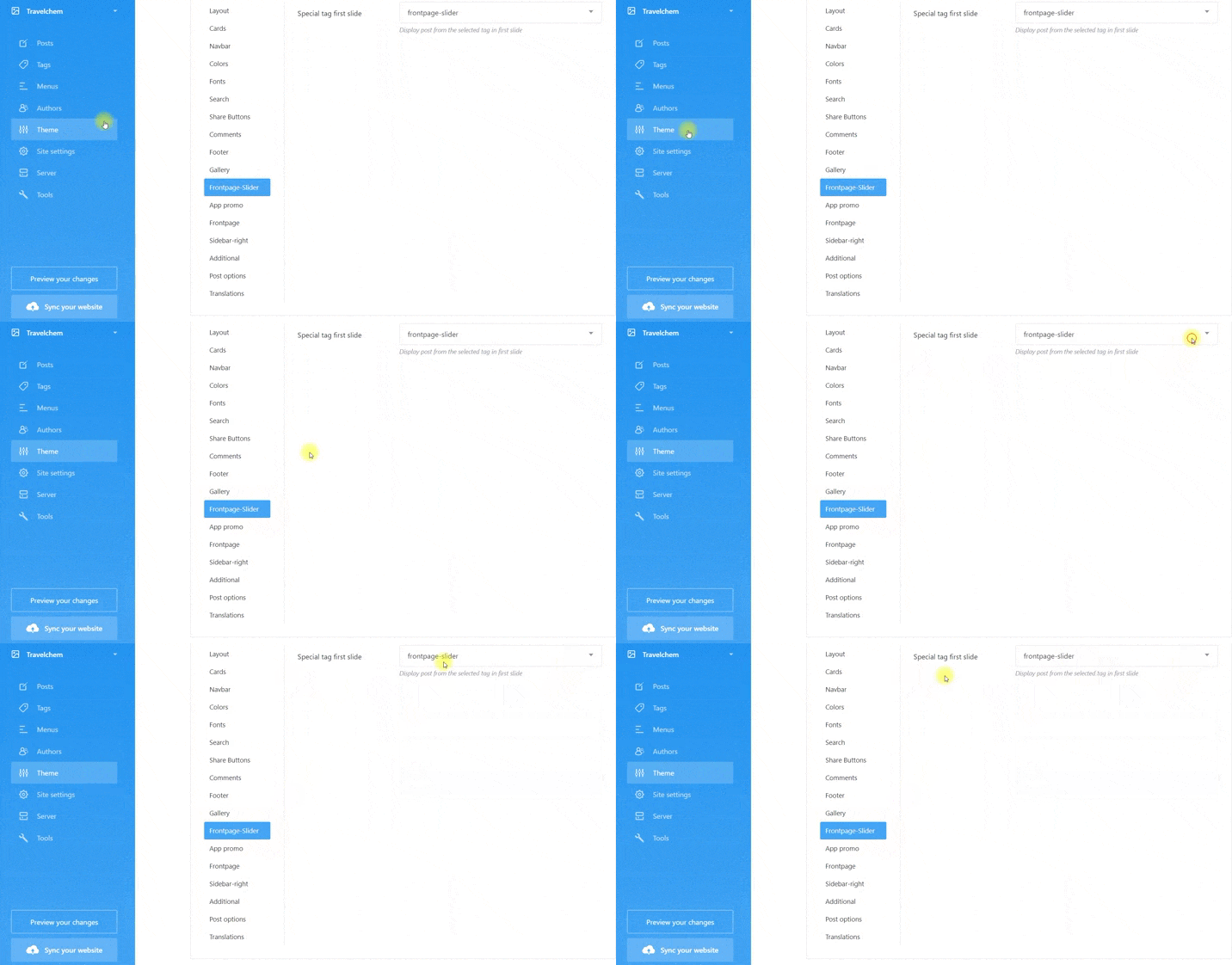
Displaying articles from the admin panel and control on the cms side: a section has been created in the site management menu that is responsible for displaying articles in the slider by selecting a tag in the drop-down list. The required articles are marked with a tag and this tag is indicated in the drop-down list in the appropriate place.
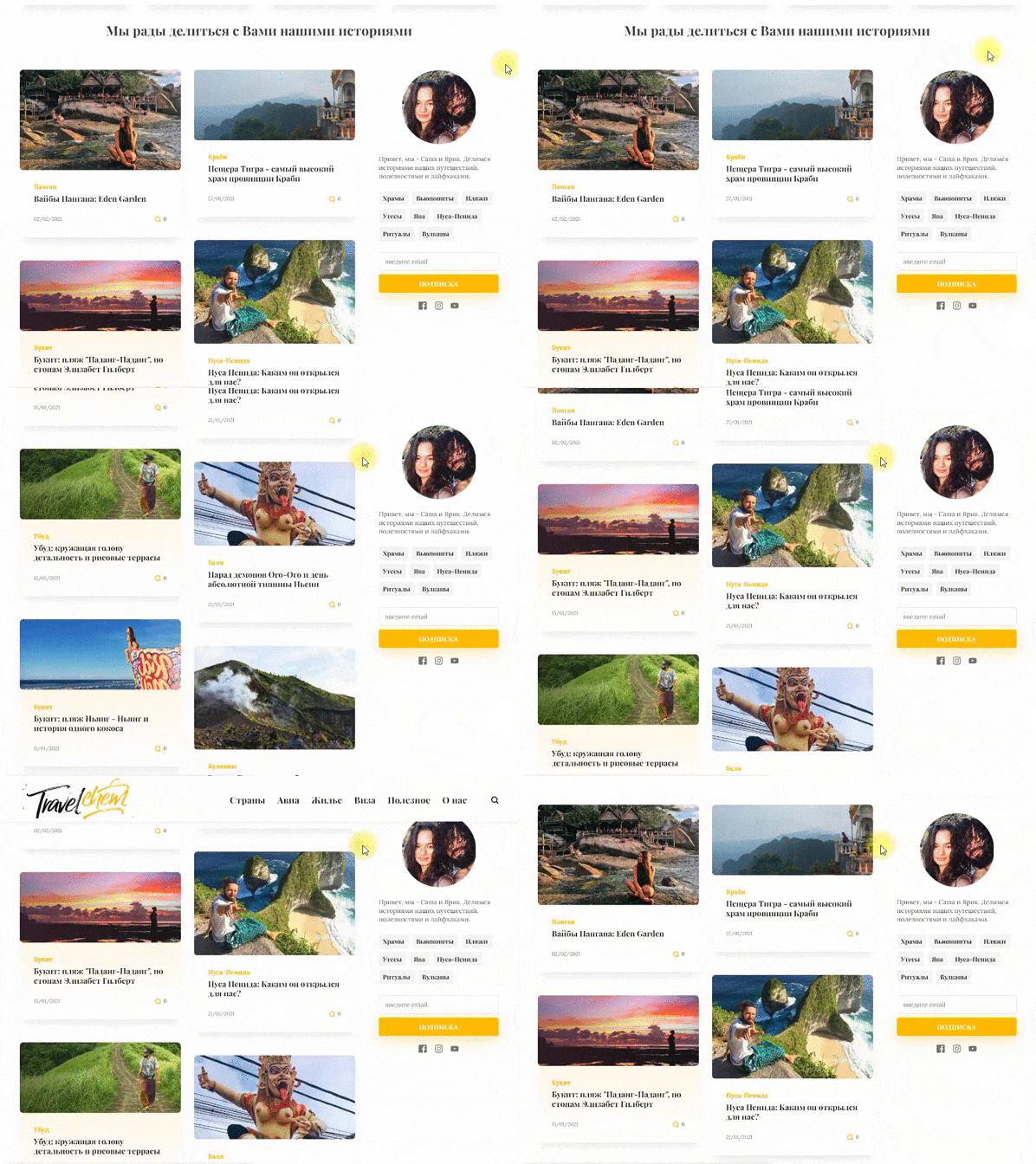
- Minimalism in the design of articles is expressed with the help of cards. Thus, in a small space of the page, you can conveniently display many articles, changing the display sequence when responsive.
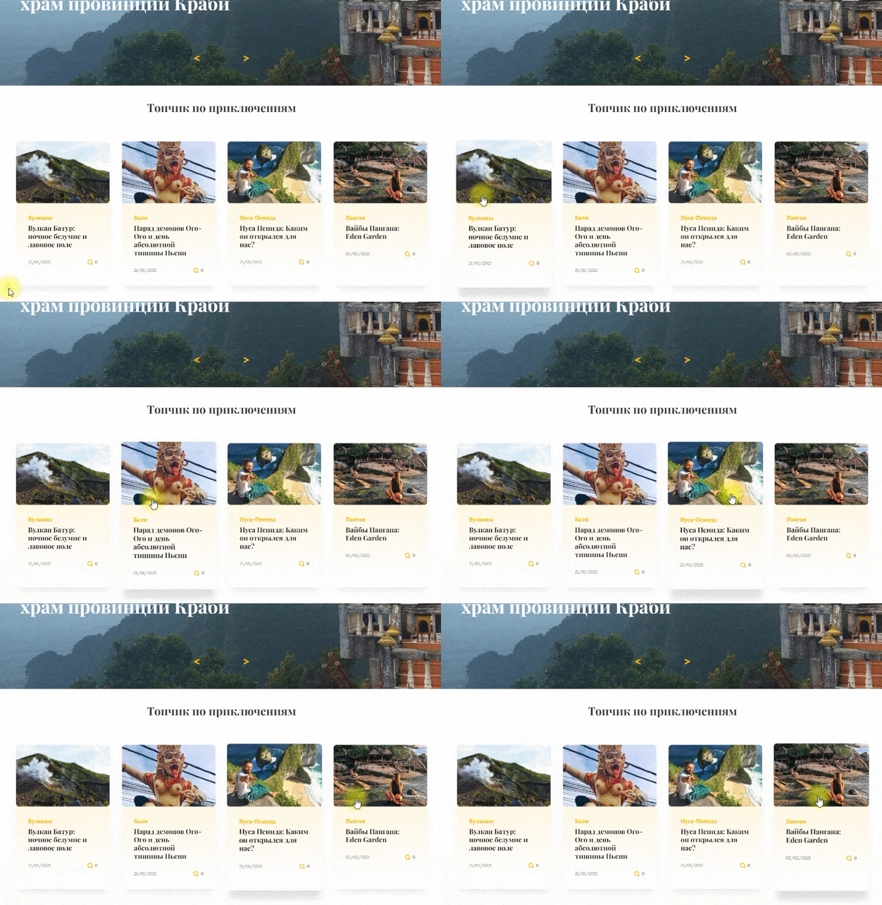
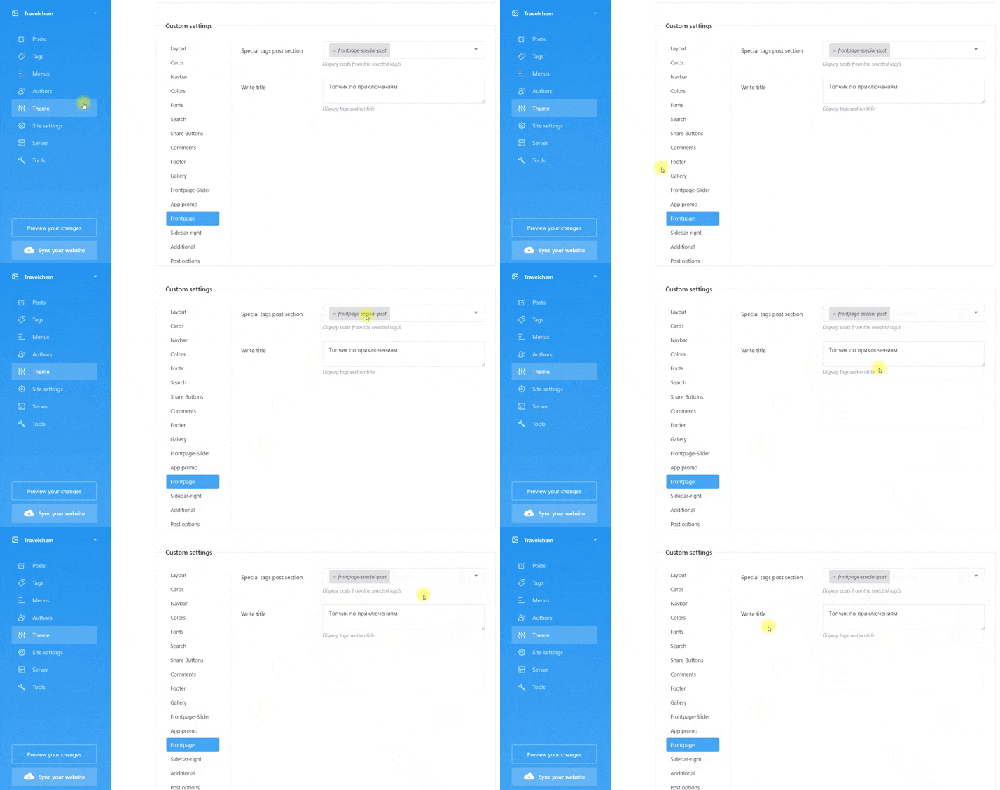
- In addition to the display of certain articles in the promo slider, the display of the second type of articles by cards is implemented. These can be top posts of the second order, as well as sponsored or advertising content. The top articles in the slider first go through the hierarchy, then an interesting selection of second-order articles (or promotional material), and in the third section, a feed of all articles is already displayed.
Displaying articles from the admin panel and control on the cms side: a section has been created in the site management menu that is responsible for displaying second-order articles by selecting a tag in the drop-down list. A special technical tag has been assigned to this section, which marks the necessary articles, but any tag can be invented and assigned. The required articles are marked with a tag and this tag is indicated in the drop-down list in the appropriate place. After specifying the tag, you can fill in the field responsible for displaying the section title.
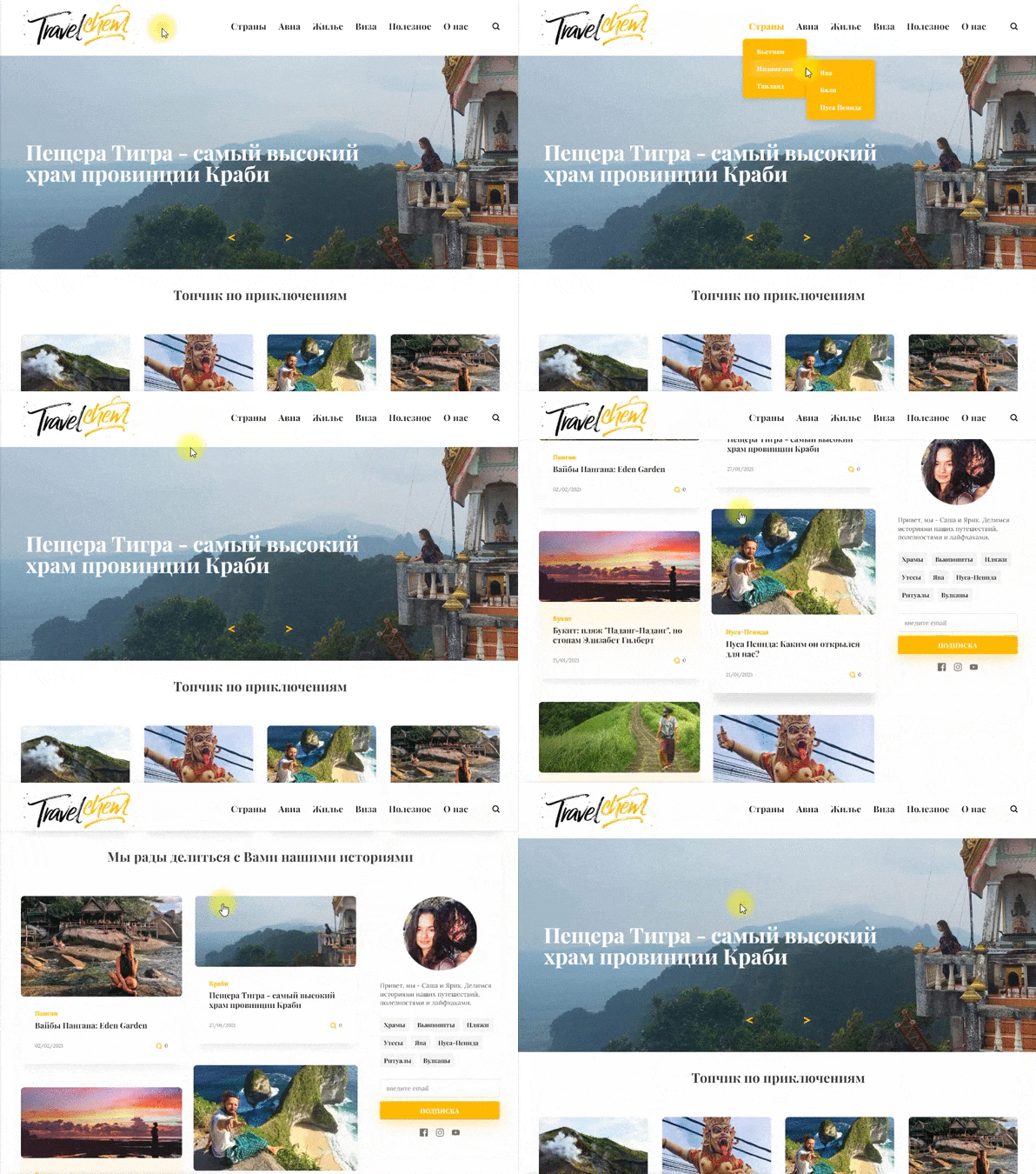
- Navigation by headings. In the desktop version, category navigation is implemented in a sticky container with nesting up to the third level.
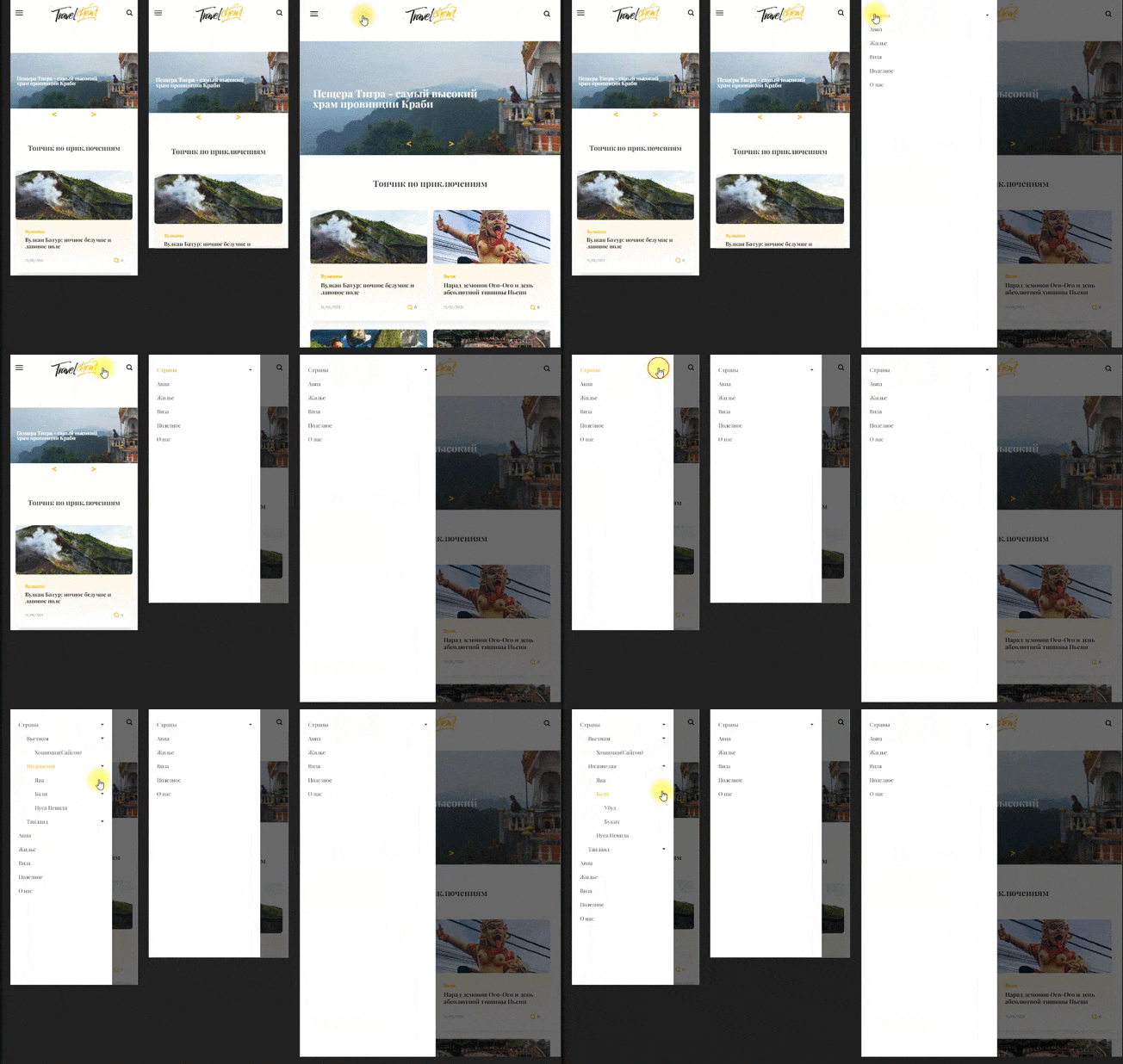
The mobile version of navigation is made on the sidebar principle, with the preservation of nesting levels.
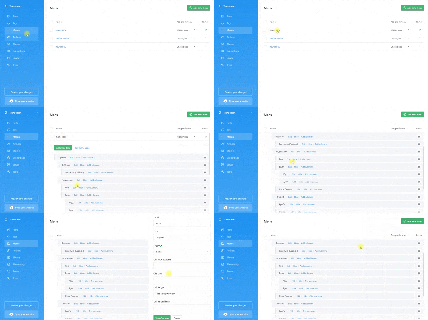
Creating a menu on the cms side: a separate section for the menu with the ability to create nesting levels
- Additional navigation: top collections, information about the authors and the subscription is realized in the side sticky sidebar.
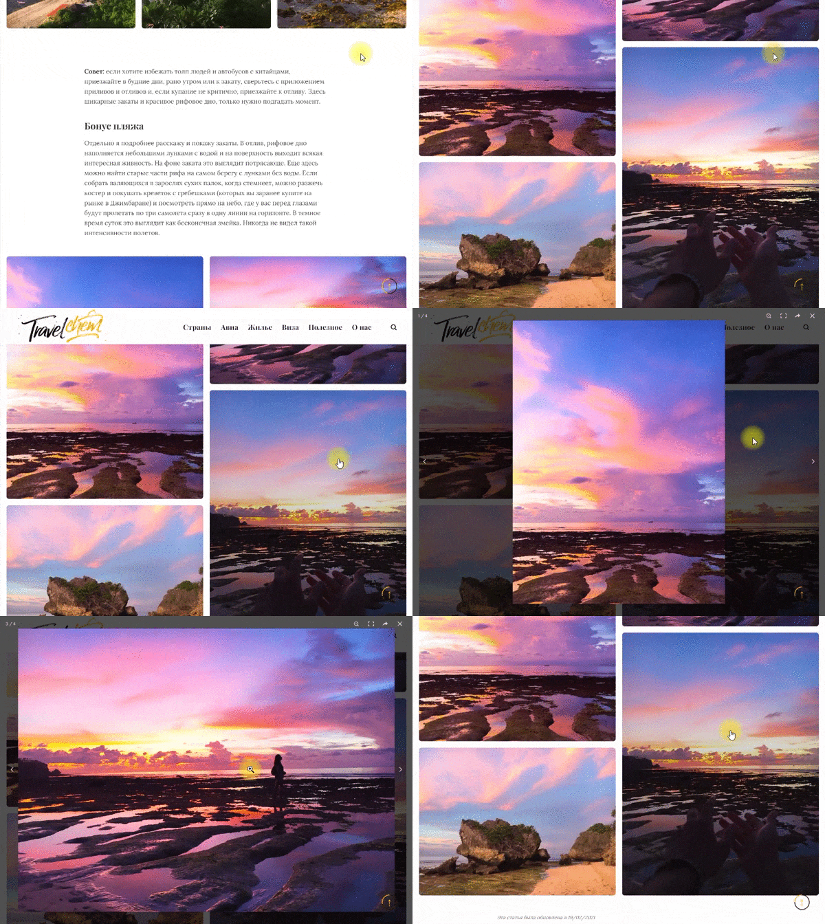
- Photo content. Since a travel blog implies a large volume of photos, special attention was paid to galleries in the articles. Photos are laid out in a trendy masonry style. The gallery functionality is implemented using the Photoswipe library, which supports zoom, touch, switching and has huge adaptive bonuses, which will be discussed below.
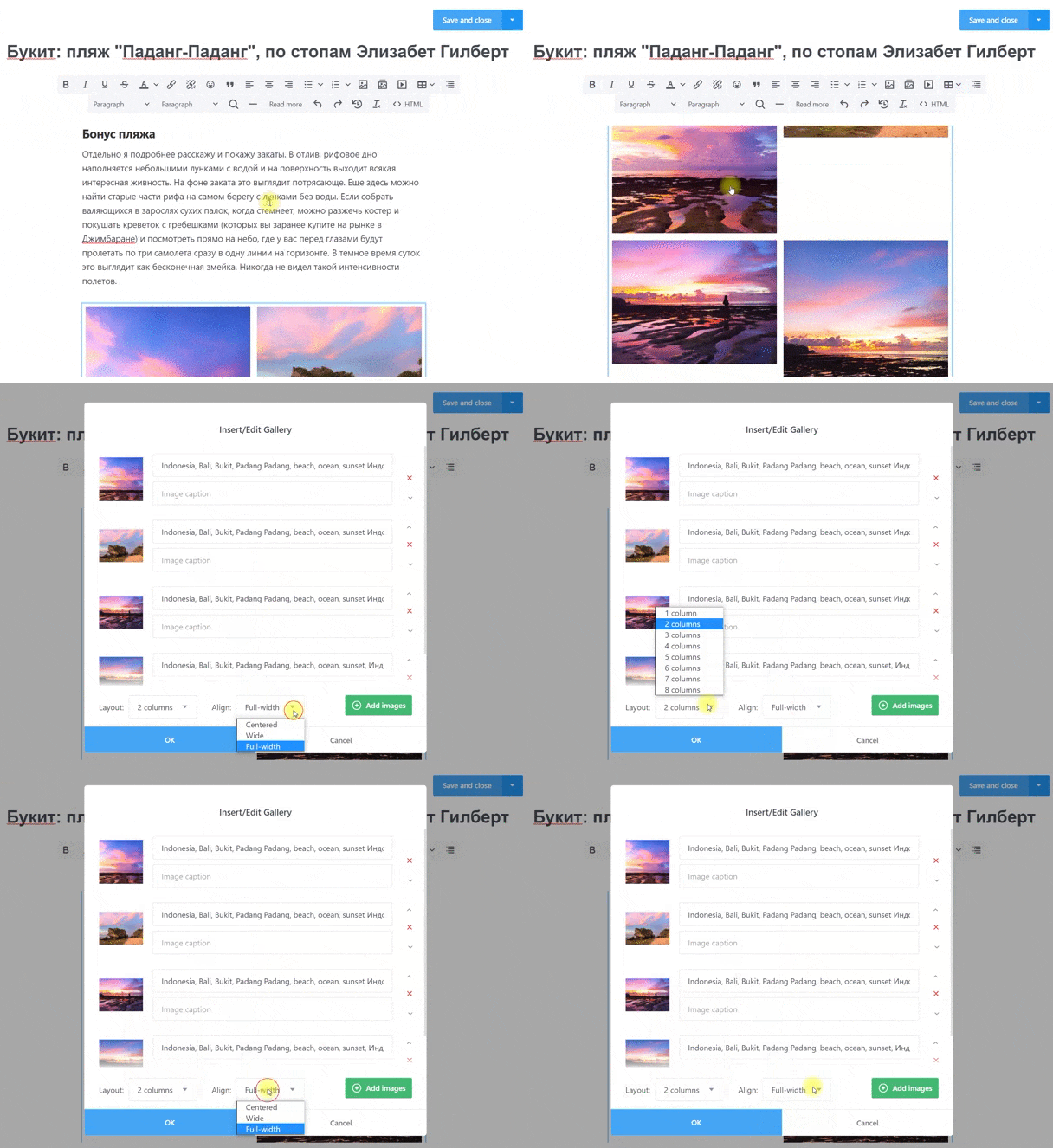
Possibilities of managing the layout of galleries from the admin panel: the gallery editor provides ample opportunity to control the photostream. When adding a gallery in the editor of the article, you can select the width of the layout of the photos, as well as the number of columns.
Responsiveness and speed optimization
The site has an adaptive layout, which allows it to be displayed correctly on all types of devices that exist today (tablets, mobile phones, personal computers).
- Navigation: responsive, shape-shifting navigation.
- The change in the layout of article cards depending on the width of the screen.
- Images: custom images, when added to the site, are automatically cut in proportions for desktop, tablet, and mobile versions and automatically substituted depending on the width of the screen. Thus, huge photos will not be loaded on mobile devices and an extra resource will not be wasted, which significantly increases the speed and is loved by all search engines. The client does not need to do anything, everything is done automatically with the settings from the admin panel to adjust the level of photo quality.
- Galleries: automatically replace photo thumbnails, original photos are loaded when you click and open a photo in the gallery. The same effect of increasing the loading speed as in the case of single images.
- Lazyloading while scrolling and loading content.
- Comments: progressive loading of comments - displayed only when the user turns to them. Significantly increases website speed without wasting time loading content that the user will not initially see.
- HTML, CSS compression of files during deployment
Correct SEO site layout
- From the first lines of code, the project is internally optimized, which is an integral part of SEO. The structure of the blog consists entirely of semantic markup tags according to HTML5 standards. Header tags are used in the correct hierarchy and do not appear in unexpected blocks.
- Sitemap.xml is generated with each build of the project.
- Lots of SEO fields to customize when writing an article, in the general site settings, SEO fields for headings, URL management, file indexing, 404 and search, prefix management.
Forms
The site has one form - a subscription. The collection of statistics and the management of companies is carried out using the third-party service Mailchimp. Changes to the form can be made from the admin panel. But these are advanced administrator settings, be careful.
Technical solutions
- I use a modular (component) approach to layout.
- Components are created and reused with Handlebars.js and are built into the CMS engine itself
- The project was implemented using the latest trends in the field of Static Website
- Lack of databases and replacing them with the principles of static websites
- Content management using a desktop application on a computer
- Deploy to the popular static site service Netlify
- Direct synchronization with hosting with one button
- Ability to edit and test content locally without using the Internet
- Additional functions of the progressive web application
- HTTPS protocol
- Fast admin panel written in Electron and Vue.js
Placing a project on the network
I chose the method of project placement, popular in the West, through the CMS App + Netlify bundle. All content is stored locally on your computer. Synchronization with the Netlify static website service is configured once and then each content update is synchronized with one button. The advantages of Netlify over standard hosting are described by many authors on the Internet. The project works over the secure https protocol, which ensures the security of the data transmitted through it.
Additional features with the addition of PWA
- Allows you to install the site on a computer or mobile device of the user on the basis of an application. It is, first of all, a simplified alternative to native apps for mobile and desktop devices. Now, having entered the site from a mobile browser, we can “download” it, after which we will see an icon on the main screen. In addition, a splash screen appears at startup, just like in mobile applications.
- Implemented the functionality of push notifications with the connection of a third-party service for collecting statistics and preparing push companies. Made for additional marketing leverage to engage and communicate with users.