Creation of a full-screen company website
Posted on
Task
The client - a pair of young developers, oriented in modern technological trends.
Wishes: modern design solutions, a full-screen slider. Lack of clutter and ease of content orientation, dark colors with points of attention grabbing. The need to solve two problems simultaneously: show minimalism, but at the same time to keep the attention and encourage to go deeper in the study of services to the subsequent filing of the application for the project.
On the main page there should be a “wow element” with animation to grab attention.
Availability forms functional, with the ability to collect data and generate tables for uploading. Duplication of the content of forms to mail and messenger.
Highly optimized download speed and SEO friendly set of functionality.
Elaboration of the structure
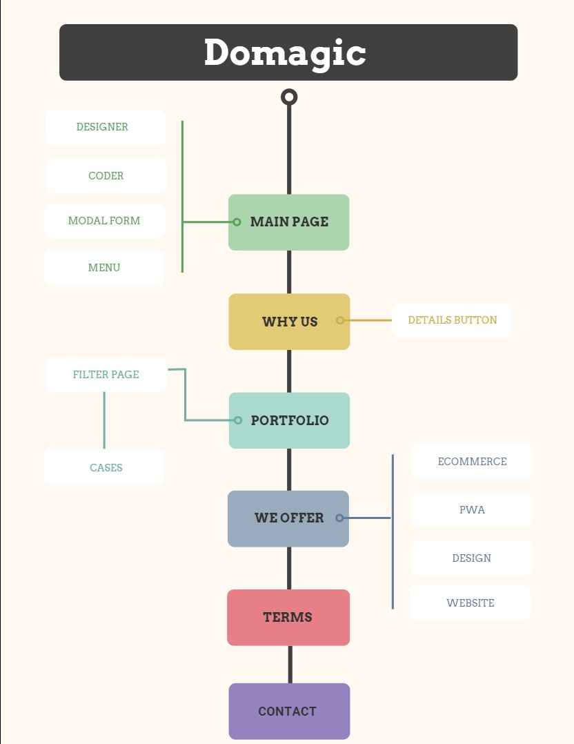
content placement logic is divided into three levels:
- the first level is made in the form of a full-screen slider with six sections - showcases and the ability to go to third-party resources or the third level of pages with detailed information.
- the second level is a page of the filter of cases of completed projects with the subsequent transition to the pages of the third level with detailed information of each case
- the third level of pages is responsible for a detailed description of that part of the content presented in the sections - showcases of the first level.
Design development and content management
Many sites of development companies contain excessively heaped information from the very beginning, trying to fit everything in the eyes of a potential client at once. We decided to take pity on the eyes of a potential client and submit information gradually. The functionality of the full-screen slider was taken as a basis, where each section is a “showcase” with a wow effect, providing quick understanding due to the minimalism of the content, but at the same time containing functionality for moving on to a more detailed acquaintance.
Logic: first we grab attention, give a general understanding, and then redirect to details.
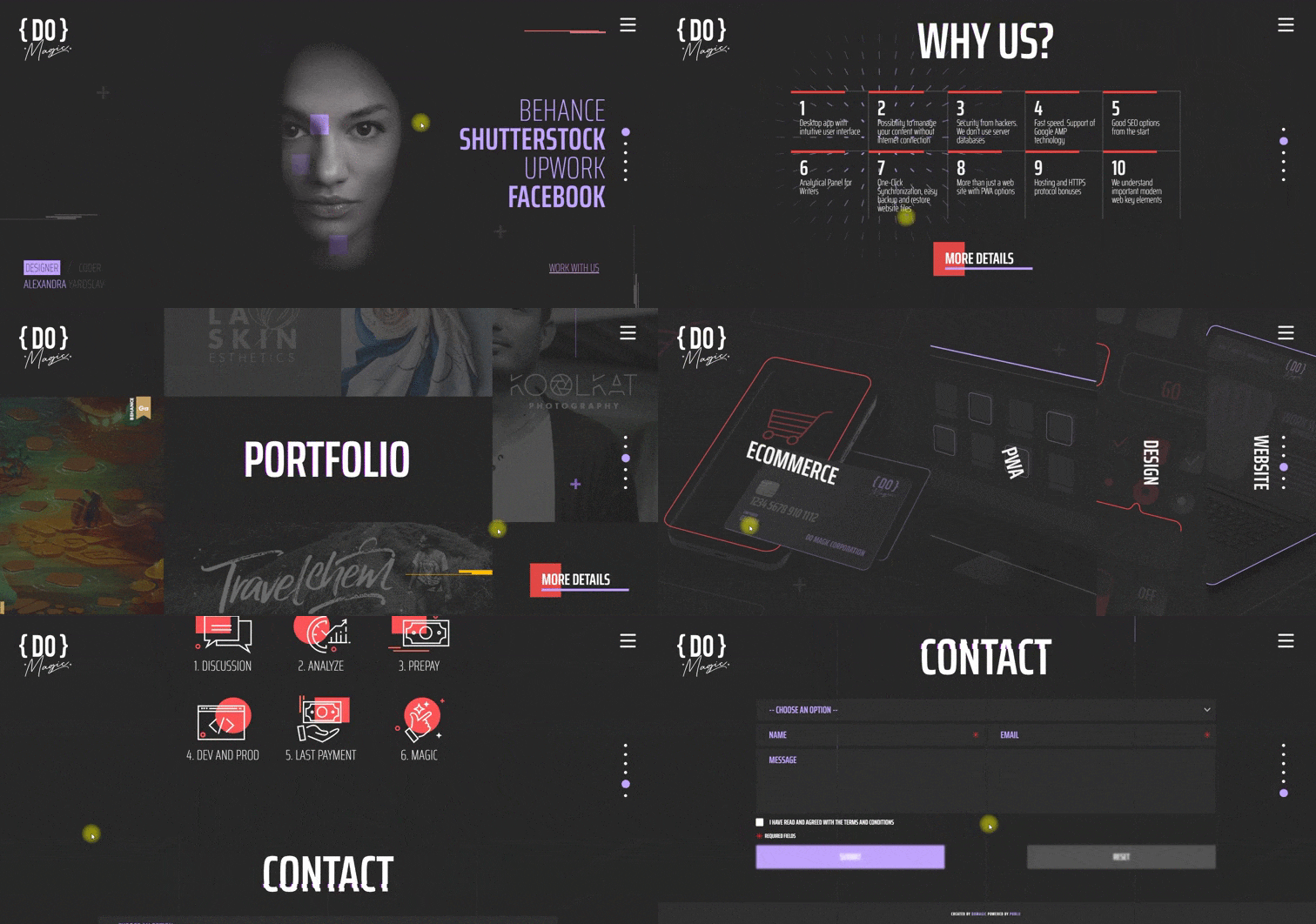
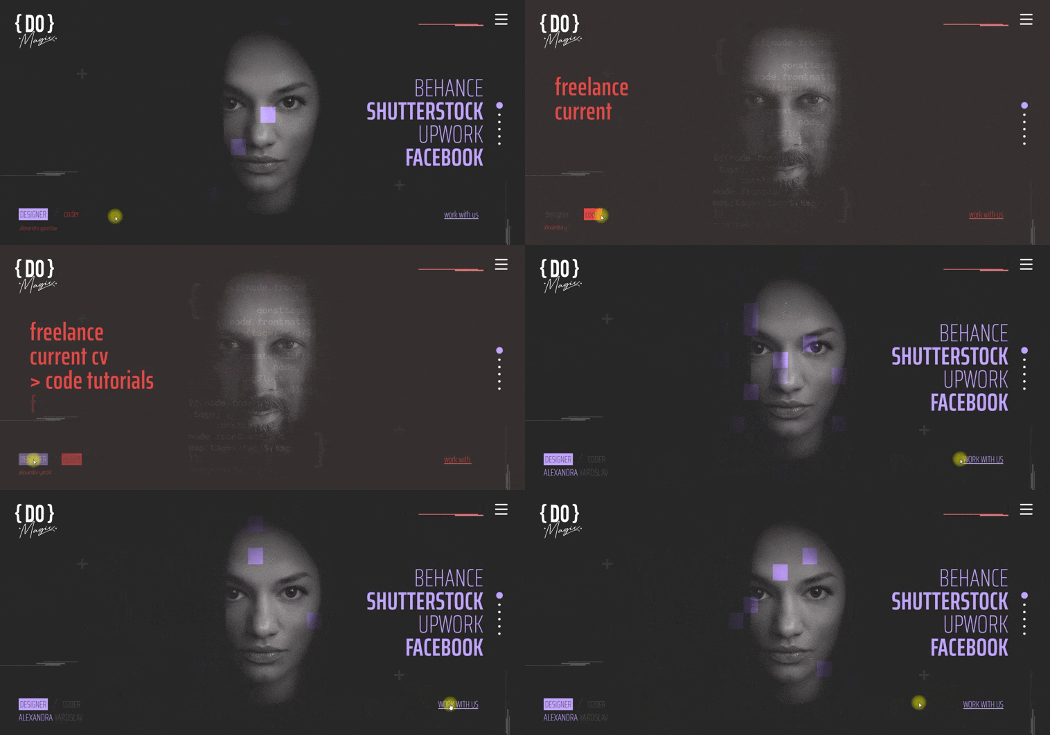
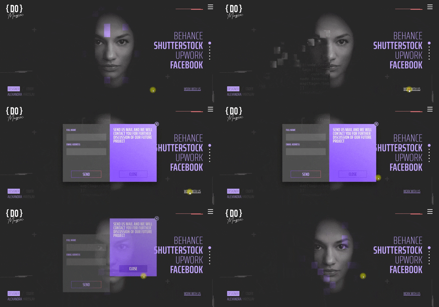
- The main screen (hero section), from the first seconds of being on the site, shows that this is a site related to design and development. Two persons work on the creation of sites: a designer and a developer. At first we showed the profile of the designer (since the design is the visual that we see - our shell), the animation transitions to the developer (the decay effect, showing that the code is the skeleton of the project).
On the desktop version of the site, a slight effect of the designer’s “observation” of the movement of the mouse cursor is implemented.
Some elements of the site are implemented with a glitch effect that emphasizes the theme of the project.
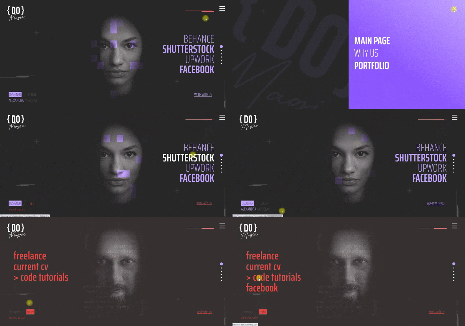
Navigation: three menus implemented. Designer menu - links to third-party resources, developer menu - the same. The general menu in the burger, which can be called up from anywhere on the site with the ability to return to the main page, get acquainted with some information in more detail, the filter page with project cases.
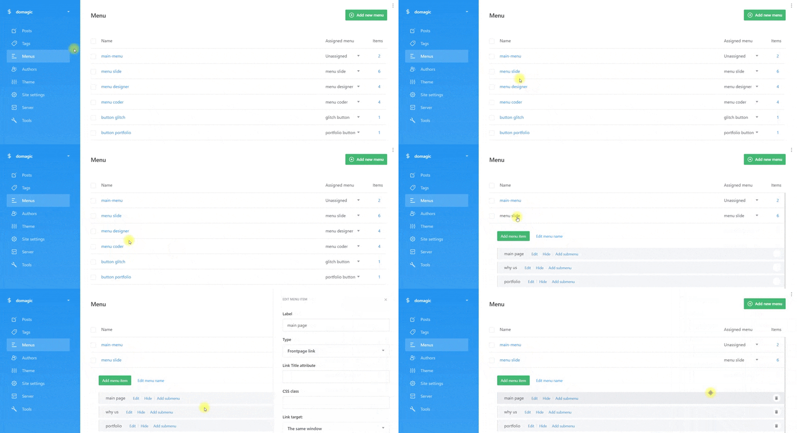
creating a menu on the cms side: a separate section for the menu with the ability to edit each item.
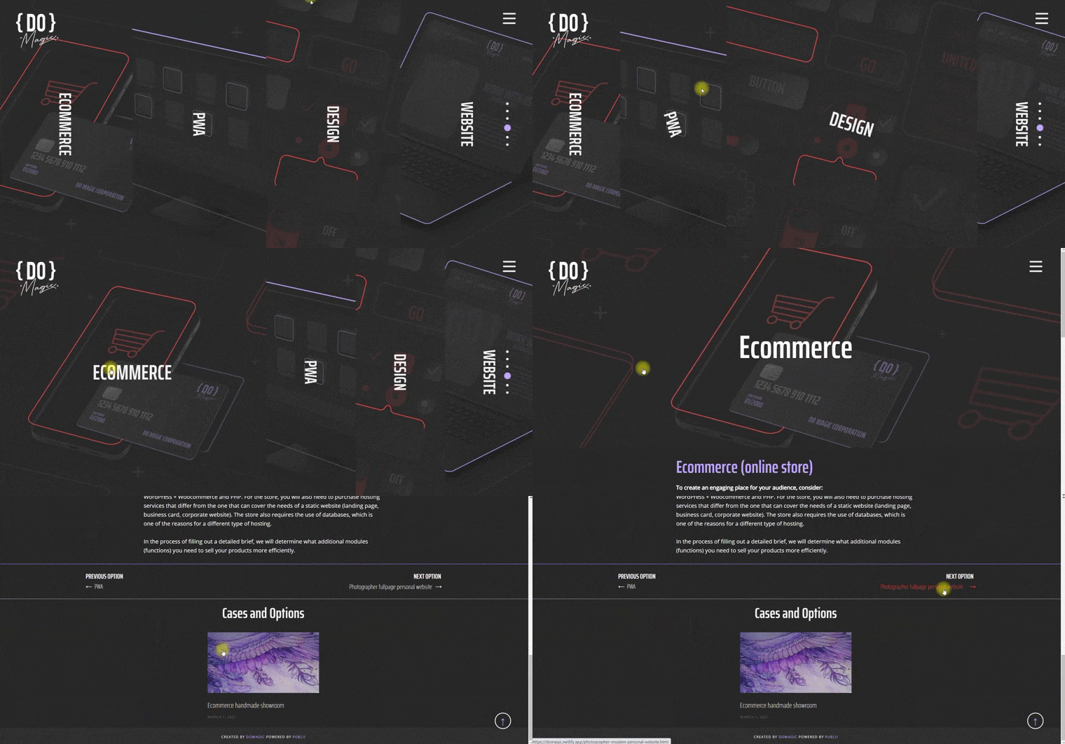
Displaying pages with detailed information in the slider section: implemented with the functionality of a vertical accordion with the ability to add new ones that were not taken into account by the original design and structure of sections. In the mobile version, the accordion is rearranged from vertical to horizontal.
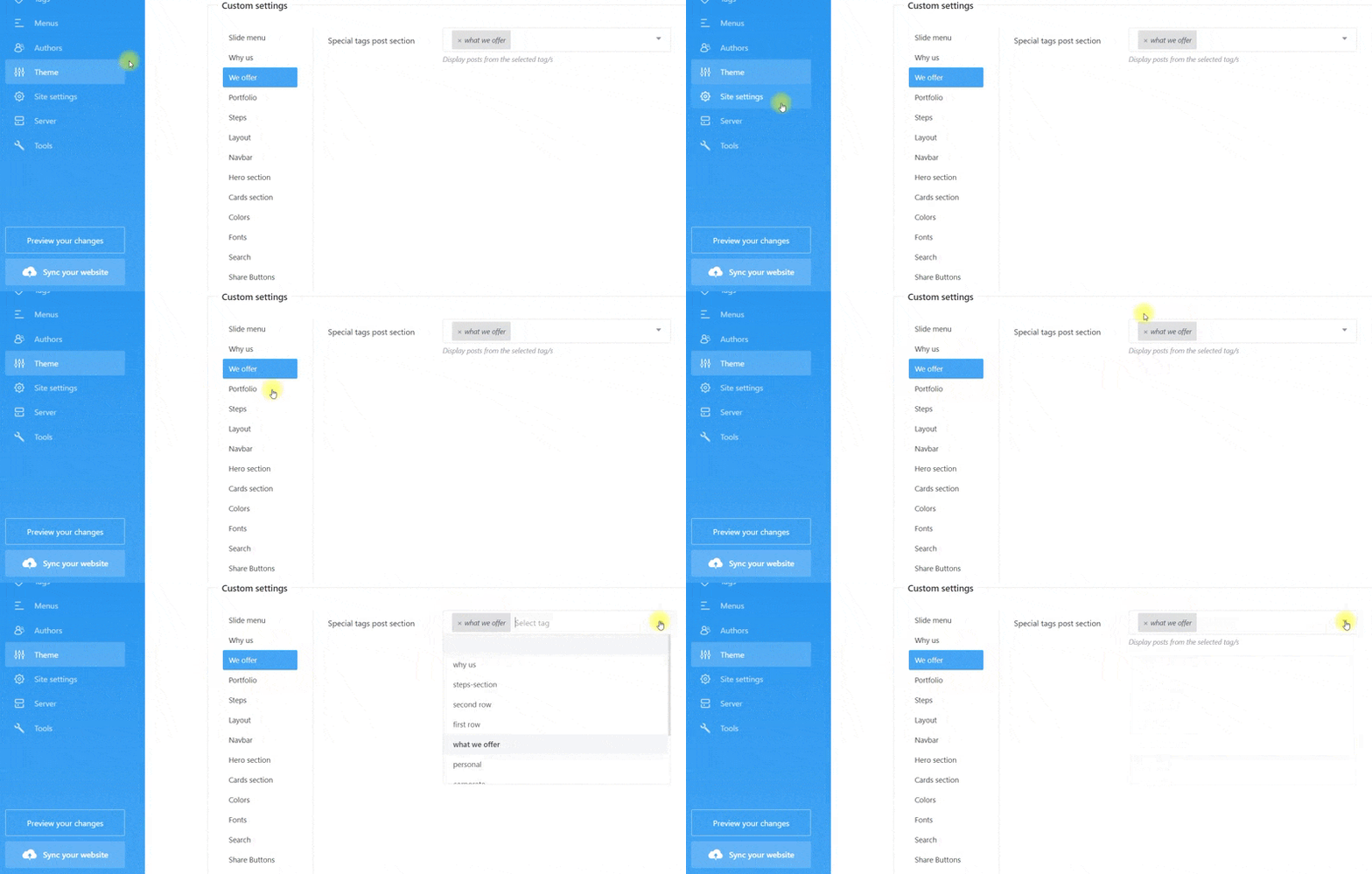
Displaying pages with detailed information from the admin panel and control on the cms side: in the site management menu, a section has been created that is responsible for displaying pages in the accordion by selecting a tag in the drop-down list. The required pages are marked with a tag and this tag is indicated in the drop-down list in the appropriate place.
Implementation of the filter page and the transition from the slider: since there are always a lot of project cases, and it is not easy to place them so that they are not cumbersome, it was decided to make a preview in the slider, leading to a separate page with the filters functionality itself, where you can choose a suitable case and go to detailed information.
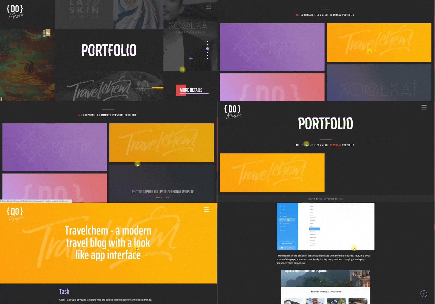
All tagged pages are automatically added to the filter. The filter does not add to the stream those pages that are marked with a tag with the “hidden” icon.
Responsiveness and speed optimization
The site has an adaptive layout, which allows it to be displayed correctly on all types of devices that exist today (tablets, mobile phones, personal computers).
- Navigation: responsive, shape-shifting navigation.
- The change in the layout of accordion page depending on the width of the screen.
- Images: custom images, when added to the site, are automatically cut in proportions for desktop, tablet, and mobile versions and automatically substituted depending on the width of the screen. Thus, huge photos will not be loaded on mobile devices and an extra resource will not be wasted, which significantly increases the speed and is loved by all search engines. The client does not need to do anything, everything is done automatically with the settings from the admin panel to adjust the level of photo quality.
- Galleries: automatically replace photo thumbnails, original photos are loaded when you click and open a photo in the gallery. The same effect of increasing the loading speed as in the case of single images.
- Lazyloading while scrolling and loading content.
- HTML, CSS compression of files during deployment
Correct SEO site layout
- From the first lines of code, the project is internally optimized, which is an integral part of SEO. The structure of the blog consists entirely of semantic markup tags according to HTML5 standards. Header tags are used in the correct hierarchy and do not appear in unexpected blocks.
- Sitemap.xml is generated with each build of the project.
- Lots of SEO fields to customize when writing an article, in the general site settings, SEO fields for headings, URL management, file indexing, 404 and search, prefix management.
Forms
The site has two forms - a quick contact form on the main page in a modal window and a detailed form at the end of the site:
Form in a modal window: for quick communication on the main screen from a pop-up window.
A separate section with a contact form: a detailed form with the ability to choose the type of question, the ability to write a cover message. Additional verification and protection from bots, “reset” button to reset input fields.
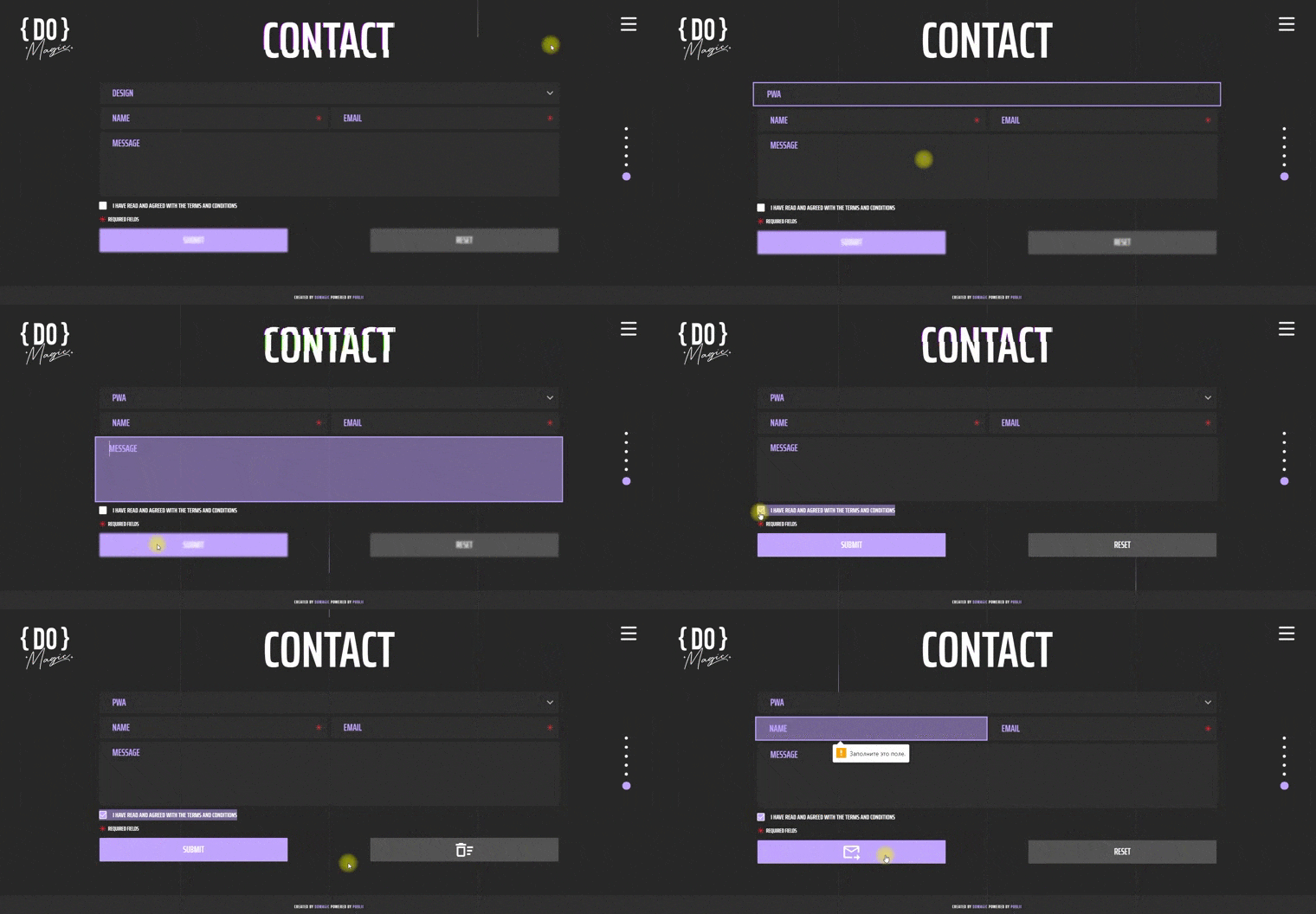
Form submission, duplication, notifications
The data from the forms is sent to the client’s page on Netlify, where the forms are divided according to the appropriate type with the ability to generate tables and upload table data in xml format. Simultaneously with Netlify, the data from the forms, with the appropriate notes, is duplicated by a letter to the mail and to a separate channel in the Slack messenger
Technical solutions
- I use a modular (component) approach to layout.
- Components are created and reused with Handlebars.js and are built into the CMS engine itself
- The project was implemented using the latest trends in the field of Static Website
- Lack of databases and replacing them with the principles of static websites
- Content management using a desktop application on a computer
- Deploy to the popular static site service Netlify
- Direct synchronization with hosting with one button
- Ability to edit and test content locally without using the Internet
- HTTPS protocol
- Fast admin panel written in Electron and Vue.js
Placing a project on the network
I chose the method of project placement, popular in the West, through the CMS App + Netlify bundle. All content is stored locally on your computer. Synchronization with the Netlify static website service is configured once and then each content update is synchronized with one button. The advantages of Netlify over standard hosting are described by many authors on the Internet. The project works over the secure https protocol, which ensures the security of the data transmitted through it.